The overriding objective is to ensure the orienteering map is legible to all competitors in all plausible competition conditions. In the past this was achieved through the use of offset printing with Pantone colours. Digital print technology has displaced offset printing. There are few remaining offset printeries, and those that do exist will be using digital plate technology, CMYK inks and are probably uninterested in the small print runs of spot colours or colour matching of CMYK tones required for orienteering maps. Today orienteering maps are almost exclusively printed on digital printers. Digital printers vary in the quality of the print. To achieve a legible work more attention needs to be devoted to print quality control.
Legibility is determined by:
Map drafting should conform to the IOF specifications including minimum gaps, minimum lengths and minimum areas. These specifications are designed for digital printing standards rather than the past era of offset printing. Compliance with the drafting standards should be checked through the process as described in the section, Mapping – What’s Involved.
There is no perfect paper for orienteering map printing. Here are some options:
New synthetic papers will continue to appear on the market. Whatever choice is made, it is best to confirm the performance of the paper in your local conditions. Is it really waterproof and colour fast? Is it abrasion resistant? Also check whether the paper is compatible with the chosen print operation and whether the printer is willing to print on the paper. Colour matching needs to be undertaken on the chosen paper.
Printer resolution is critical to the legibility of maps. Printer resolution is measured in lines per inch (lpi). The IOF recommends minimum printer resolution according to the event format:
A print of the IOF PrintTech Test sheet will test the resolution of the printer. See the document titled “Instructions for using the IOF PrintTech Test Sheets” by clicking on the image below.
It is possible to print directly from either OCAD or OOM mapping software or from course setting software. This is rarely done however as the pdf file format is universal in the print industry, unlike orienteering specific software. All mapping and course setting software have pdf export capability. Pdf files can be easily exchanged between course setting and organizing team members for checking.
Process for exporting from:
In the era of offset printing with Pantone spot colours, every print run produced the colour required by the specification. In the era of digital printing using a mix of CMYK inks, each printer will produce a different colour for the same CMYK colour setting. Sometimes the variations are small, sometimes they are large. The colours coming out of the one printer can change with a change of inks or a change of print driver software. Before printing for a major event it is worth checking if the printer has the latest driver. CHECK HERE.
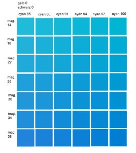
Colour checking and adjustment needs to be undertaken before each print run. The process of colour adjustment needs to follow the same workflow as planned for map printing. This generally means converting output of the colour swatches to pdf format before the test prints. This pdf is then printed on the printer being used for the final print run:
Each of these files prints a gradient of appropriate ink mixes from which you can choose the closest to the specification. Below is an example for the colour blue.

Compare the resulting colour swatches with an IOF supplied PrintTech test sheet and select the best matching ink mix for each colour. Set the colour table in OCAD to the chosen colour mixes and then print the OCAD version of the IOF PrintTech sheet and compare the resulting colours with an IOF supplied PrintTech test sheet. (Copies of these sheets were distributed to mappers in all states in 2019. If you don’t have a copy, seek assistance from other mappers in your state. The IOF no longer has copies available.)
After comparison you may need to adjust the CMYK mix in the OCAD colour table for the map and try again. This should lead to a reasonably accurate colour mix in one or two matching cycles.
Note that the IOF produced two comparison test sheets, one printed offset using the correct Pantone colours and one digitally printed with the best colour match they could obtain. Digital printers cannot accurately replicate some of the Pantone colours – yellow and purple in particular. You will not achieve a perfect colour match for these colours, but will have to satisfy yourself that the match you have achieved is the best possible.
The process of colour adjustment is assisted by a cooperative print operator who understands the requirements of the orienteering community. Turning up to a print shop unannounced will rarely give a suitable print outcome.
There are some regional variations that have arisen in Australia to deal with local conditions.
These adjustments assume that the colour table is already matched to the IOF standard and is then adjusted pro-rata to these variations.
A further local adjustment is the placing of purple in the colour chart below black, brown and blue. This can be achieved in the OCAD file, or using the Condes course setting software. This placement ensures that the course symbols do not obscure important detail on the map. The latest colour table in OCAD has two purples, one in an upper and one in a lower position. If course setting with OCAD this may be sufficient to maintain visibility of map detail.
It is no longer required to obtain approval to use digital printing for major Australian events.
The ubiquity of digital printing has placed extra responsibilities on the organisers of major events. Map printing must therefore be high on the list of concerns for both organisers and event advisers. One major lesson learnt at many recent major events is that it is wise to leave time in the organisational schedule to deal with unexpected printing issues. They will happen.